Magazine Spreads
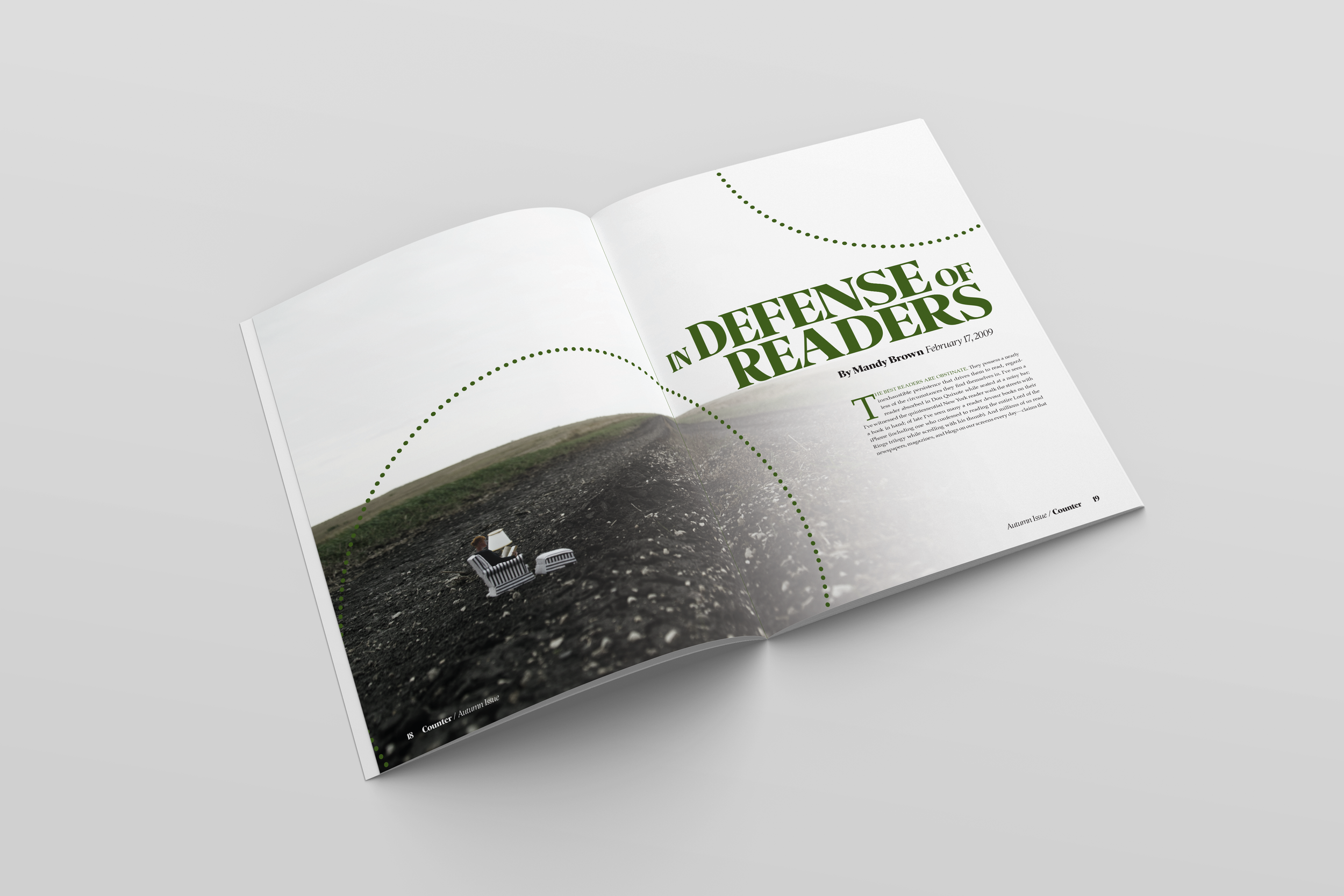
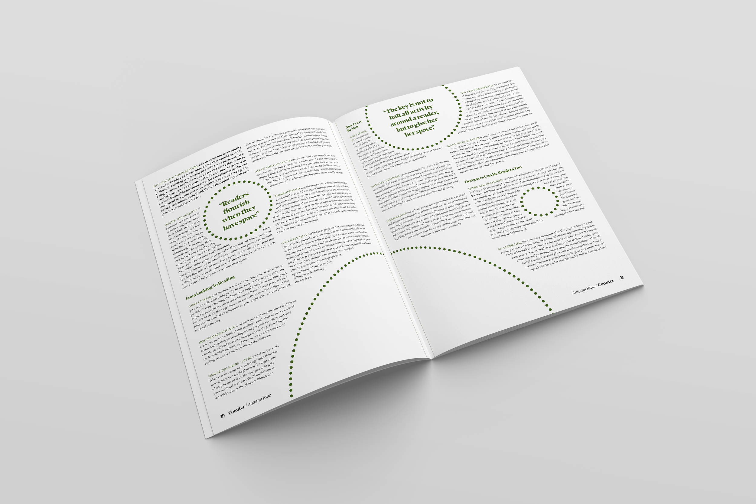
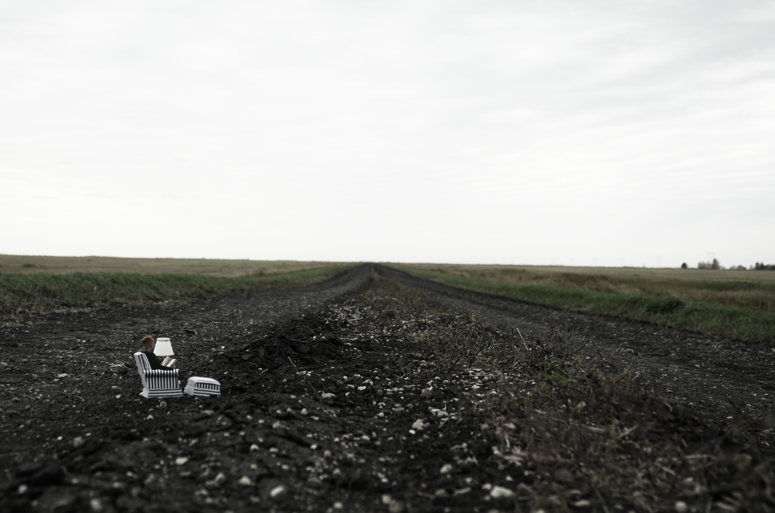
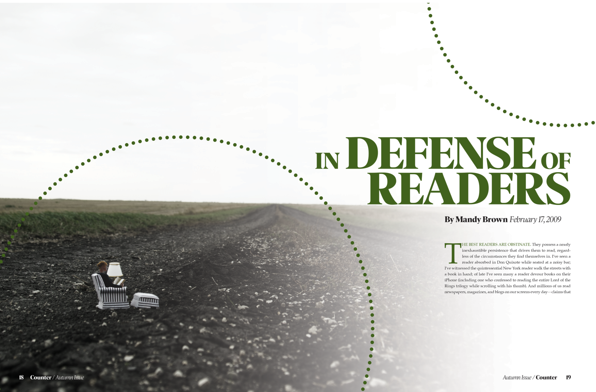
The goal of this project is to take an article found online and turn it into a four-page magazine spread. The designer used her own photography to better convey the article's theme. In the images, the figure is given ample space and was photographed and edited to appear isolated. The article talks about how reading individually is a solitary experience that puts you into your own little world. It goes on to explain how designers should be taking extra care to design a better experience for online readers. The circle theme represents the space designers should be giving online readers, rather than creating small text margins filled with ads. The “reader” character in the images is made to look cozy and peaceful, just as designers should be making online readers feel.